3 New Audit Widgets
We’ve recently rolled out 3 new audit widgets, further enhancing the depth of insights available to support your audits:
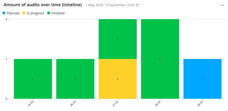
Amount of Audits Over Time (Timeline) Widget
This widget displays the number of audits that have taken place/are taking place within a given time period, classified based on their status – in the format of a bar chart.
That way, you can keep track of the progress of your plant’s audits and follow-up when needed.
The X-axis represents the time, while the Y-axis represents the number of audits.
See the amount of audits over time widget for more details.
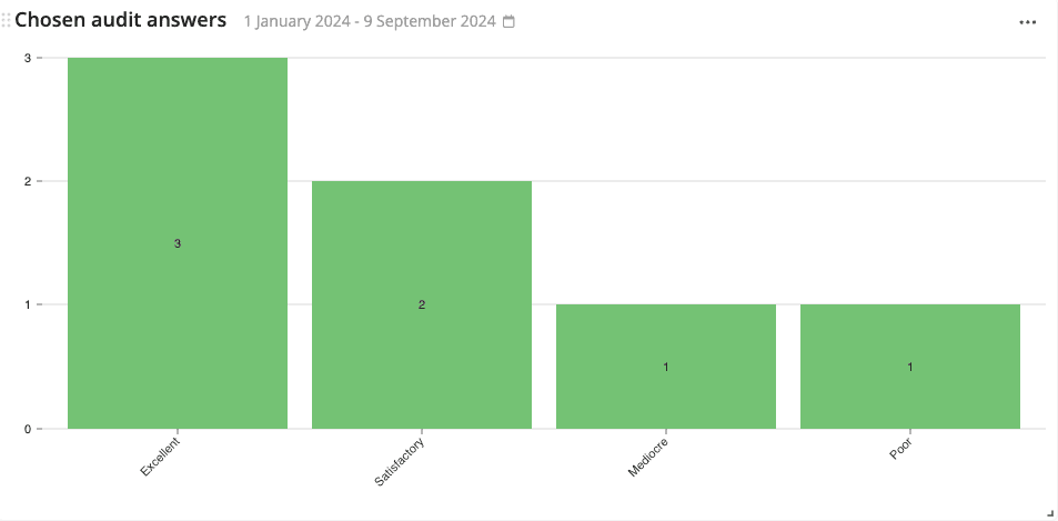
Chosen Audit Answers Widget
This widget shows the answers (and their frequency) to product checks on audits within a given time period – in the format of a bar chart.
This widget is exceptionally useful if you would like to analyze one specific question/test within an audit deeply and its frequency over time.
For example, the image below shows the frequency of answers to the audit question: “What is the general level of awareness among plant employees regarding fire safety procedures?”
The X-axis represents the answers to the chosen product check type, while the Y-axis represents the quantity of those answers.
See the chosen audit answers widget for more details.
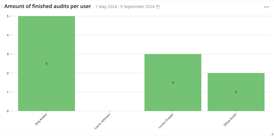
Amount of Finished Audits per User Widget
This widget shows the number of audits that have been finished by each employee within a user group in a given time period – in the format of a bar chart.
This audit is useful to keep track of your employees’ workload and performance.
The X-axis represents the employee names, while the Y-axis represents the number of audits that have been finished.
See the amount of finished audits per user widget for more details.