
Amount of Issues per Status Over Time (Bar Chart)
What Is Displayed in This Widget?
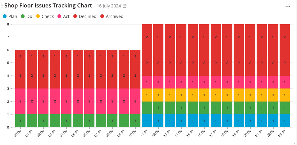
This widget displays the number of issues in your workspace within a certain time period, classified based on the status of each issue – in the format of a bar chart.
The X-axis represents time, while the Y-axis represents the number of issues.
Note: Before creating a dashboard with this widget, make sure that there are tickets that have been submitted by the operators.
How to Deploy This Widget?
Please follow the steps below to deploy this widget to a new dashboard. However, if you would like to deploy this widget to an existing dashboard, then you can navigate to that dashboard and start from step No.4 instead.
- Click on “Dashboards” on the side panel.
- Click on the plus icon under “Dashboards”.
- Type in the new dashboard name.
- Click on the yellow plus button on the bottom right of the screen.
- Navigate to “Amount of issues per status over time (bar chart)” under the “Improvement boards” widget category, and click on “Create”.
- Select the improvement board that you would like to be displayed.
- Select the improvement flow(s) that you would like to be displayed.
- Select the column(s) that you would like to be displayed.
- Click on “Add”.
- Click on the date range (next to the widget name), and adjust the date range. Make sure that it covers the time period where the audits were executed. Click on “Custom rolling range” for more date range options.
- When you’re done, click on “Save”.
- Click on “Yes”.
- Adjust the widget’s size as desired.
Configuring the Widget
Check out how you can configure an Azumuta widget.